
Colour as a design element
JUNG in a colour rush
Colour is far more than a matter of personal taste. It can structure spaces, alter proportions, aid orientation, and influence moods. With its new digital training course, "FARBrausch (Colour rush) – Colour as an element of architecture", the JUNG Academy explores this multifaceted design tool, combining historical principles with concrete examples from the built environment. Three current reference projects – the Goethe-Institut in Kuala Lumpur, an apartment in Vilnius and Landhaus Averbeck in the Lüneburg Heath – showcase different approaches, ranging from strong contrasts and nuanced colour schemes to the tonal integration of the electrical installation.
From colour theory to colour systems
How does colour shape spaces, architecture, and perception? The JUNG Academy’s online training course "FARBrausch" spans historical colour theories, the Bauhaus and Le Corbusier’s Polychromie Architecturale. A key focus is the development of colour theories and systematic shade systems. Using historical approaches from Democritus to Isaac Newton, Johann Wolfgang von Goethe, and Philipp Otto Runge, the course traces how its understanding has changed. At the Bauhaus, Johannes Itten, Wassily Kandinsky and Paul Klee explored the relationships, contrasts and effects of different hues, thus shaping modern colour theory. Today, systems such as RAL, NCS, Munsell and Pantone make it possible to identify indivuals shades unambiguously, compare them and reproduce them reliably. The course contextualizes these diverse approaches, providing a foundation for a more conscious use of color.
Using striking architectural examples, the training demonstrates the different spatial effects it can create and how it can be used as a design tool: Colour follows geometries, highlights individual building components, creates contrasts, or unites materials and surfaces into a cohesive spatial concept. Frank Lloyd Wright's Fallingwater illustrates a nuanced modernist palette. The Masters’ Houses in Dessau reveal the surprisingly intense colour schemes concealed behind the supposedly white Modernism. MVRDV's Markthal in Rotterdam exemplifies an expressive contemporary use, its richly colored interior contributing significantly to the building's identity and spatial impact.
Les Couleurs® Le Corbusier®: Colour as part of architecture
Particular attention is paid to Le Corbusier’s Polychromie Architecturale. For the architect, colour was not a decorative addition but an architectural design tool in its own right. With his colour keyboards of 1931 and 1959, he developed a system of 63 hues whose selection and combination were specifically geared towards their spatial effect. The system is based primarily on hues found in nature, which Le Corbusier selected so that they could be combined harmoniously. He attributed specific spatial effects to the individual groups: blue and green tones can make surfaces appear to recede and create a sense of spaciousness, while red, ochre and brown tones anchor walls more firmly within the space and emphasise their presence. Grey and umber tones, in turn, can make building components and surfaces recede into the background. With these colour keyboards, Le Corbusier grouped the shades into different harmonious schemes, creating a tool for architectural colour design.
This is precisely where the connection to JUNG comes in: JUNG is the world's only manufacturer to offer switches and sockets in the 63 original shades of Les Couleurs® Le Corbusier®. Furthermore, JUNG is part of a network of licensed manufacturers across various product lines. Because all partners manufacture according to the same binding colour standards, the products of these manufacturers can be coordinated and combined to create consistent design concepts. At JUNG, the 63 Les Couleurs® Le Corbusier® colours are available for products in the LS range.
Knowledge conveyed concisely and digitally
The online training course comprises 15 chapters on the history and theories of colour, its psychological effects and Les Couleurs® Le Corbusier®. Interactive knowledge checks supplement the content and translate theoretical concepts into design practice. The training is led by Nicole Heptner, architect and expert in architectural communication and marketing, and Jana Bogatsch, business psychologist and marketing consultant at the JUNG Academy. "FARBrausch" demonstrates the nuanced ways in which colour can be used in architecture – and how a consciously chosen hue can become an integral part of the design. The training is available online through the JUNG Academy. Participation requires a myJUNG Account, which can be created easily and free of charge.
Colour in built practice
Three JUNG reference projects in Kuala Lumpur, Vilnius, and the Lüneburg Heath demonstrate the diverse ways in which colour can be used as part of an overall architectural concept. The spectrum ranges from deliberately created contrasts and consistently monochrome designs to nuanced colour schemes tailored to materials and spatial atmospheres.
Goethe Institute Kuala Lumpur
At the Goethe Institute Kuala Lumpur, the Malaysian firm Stoked Associates has developed an interior design that interprets the space as both a language institute and a cultural meeting place. Reception areas, event spaces, the study lounge, classrooms, and offices each acquire their own distinct character through different colours. The electrical installation is consistently integrated into this concept: LS 990 and KNX F 50 push-button sensors in Les Couleurs® LeCorbusier® use contrasts, complementary effects or calm combinations, depending on the area. In this way, the control elements reinforce the atmosphere of each space and themselves become part of the design concept.
https://www.jung-group.com/en-DE/Goethe-Institute-Kuala-Lumpur-Malaysia/48672
Apartment in Vilnius
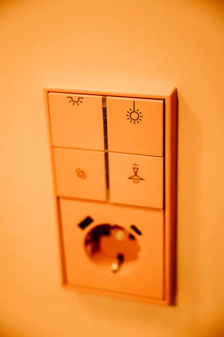
At the Strazdelio Street Apartment in Vilnius, the usual design sequence is, in a sense, reversed: For the interior designers at MIGLE & MILDA, the light switch was the starting point for the colour scheme, which began with LS 990 in 32090 rouge vermillon 31 from the Les Couleurs® Le Corbusier® palette. The walls, ceiling and built-in furniture in the hallway all pick up this exact shade of red, developing it into a monochrome spatial composition. Here, the light switch does not provide an accent; instead, it sets the colour for the entire room. An element of the electrical installation thus becomes the basis for the interior design.
https://www.jung-group.com/en-DE/Residential-building-in-Vilnius-Lithuania/105738
Landhaus Averbeck
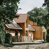
At Landhaus Averbeck in Bergen in the southern Lüneburg Heath, colour forms part of a multifaceted interplay between historic building fabric, new timber buildings, natural materials and individually designed interiors. The farmstead, which has evolved over centuries, was expanded in 2018 with Family Cabins by Carsten Iseken of Iseken Architektur; the most recent interior design of the guest rooms in the farmhouse is by Désirée Smith. Different shades of ochre, orange, terracotta and rose, as well as nuances of blue and grey, give the rooms and communal areas their own distinct atmospheres. Switches and sockets from the LS 990 range in eight shades from Les Couleurs® Le Corbusier® pick up the respective colour scheme. They blend seamlessly with the walls, furniture, and materials, making the electrical installation an integral and natural component of the interior design.
https://www.jung-group.com/en-DE/Landhaus-Averbeck-Bergen-Germany/105614
The examples from Kuala Lumpur, Vilnius, and Bergen illustrate the breadth of architectural chromatic design: carefully selected tones shape atmosphere and spatial effect, create contrasts, or unite surfaces, materials and details into a harmonious whole. The online training course "FARBrausch – Colour as an Element of Architecture" explores these different perspectives in greater depth and provides a foundation for the conscious use of colour in architecture and design.
To the Online Training:
https://www.jung-learning.com/ilp/pages/description.jsf?menuId=1108&designMenuId=1108#/users/@self/catalogues/116698/courses/220166/description
To Les Couleurs® Le Corbusier®:
https://www.jung-group.com/en-DE/Products/Switch-Ranges/LS-990-Les-Couleurs-Le-Corbusier/
Images:
All the images shown, as well as other reference images, can be used free of charge for editorial purposes provided the copyright is indicated. All images may only be used freely in the context of reporting on JUNG. Any further uses (such as covers or contributions unrelated to JUNG) require a separate agreement with the rights holders.
Download: https://jung.canto.de/b/H5EKC
Image credits:
Goethe Institute Kuala Lumpur:
© Architecture: Stoked Associates, Photo: Kit Cheng
Apartment in Vilnius:
© Architecture: Miglė & Milda, Photo: Lina Adinavičienė
Landhaus Averbeck:
© Photo: Landhaus Averbeck GmbH & Co. KG/Timo Jaworr
Descargas
Contacto
¿Tiene alguna consulta de prensa? Póngase en contacto con nosotros:
Enviar email





Galería


