The power of colour: The effect of colour in interiors
Colours play a decisive role when it comes to well-being and atmosphere in interiors. They can calm, stimulate or even influence the perception of a room. For builders and renovators with no prior technical knowledge, it is important to understand how the right choice of colour can make a positive difference to the home. This guide provides an overview of colour impact, its connection to interior design, and how to add colour to creative projects such as painting tiles and matching electrical installations.
The right choice of colour: How colours work
Colours have a psychological effect on people. Blue calms, red activates, yellow provides cheerfulness. However, choosing the right wall colour depends not only on personal taste, but also on the function of the room and its size.
The language of colours: What's behind the colours?
Every colour tells a story.
Painting tiles: Creativity and renewal the easy way
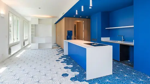
Tiles are often considered static and unchanging, but modern colours and technology can breathe new life into them. Painting floor tiles is a cost-effective and creative way of modernising old surfaces without having to tear them out completely.
- Preparation: Thorough cleaning is necessary before painting tiles. Old joints should be repaired and unevenness repaired.
- Choice of colour: Hard-wearing colours such as special tile paints or epoxy resin are recommended for painting tiles. These colours adhere well to smooth surfaces and are resistant to moisture and abrasion.
Further contributions


Interior design to match the wall colour
Colours set the tone for the entire interior design. To create a harmonious overall look, the wall colour, furniture and accessories should be coordinated.
Coloured electrical installation: a trend that is here to stay
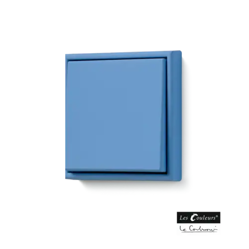
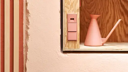
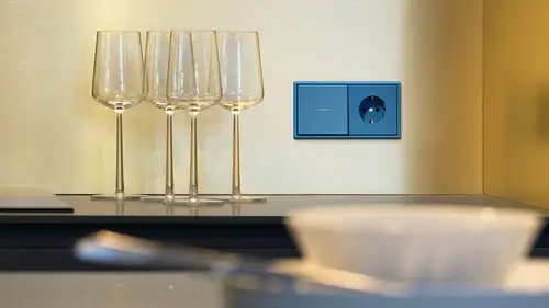
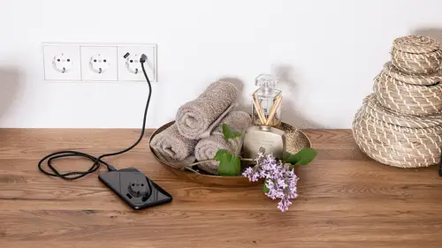
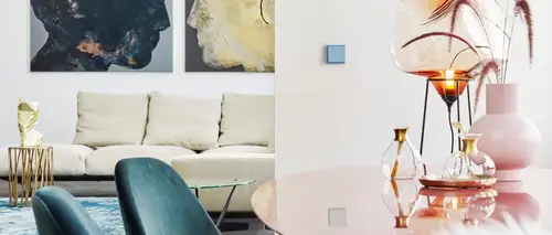
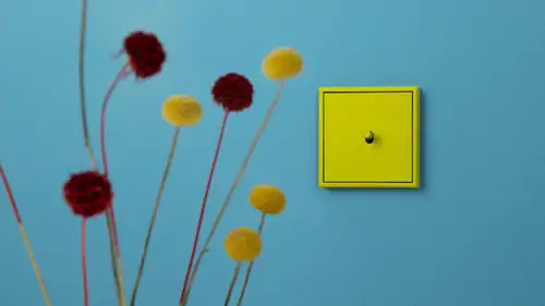
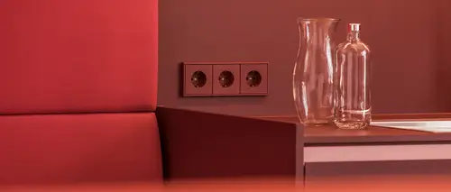
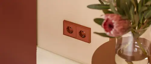
The days of pure white or grey sockets and light switches are long gone. Coloured electrical installations that blend harmoniously into the room concept are a trend that underlines modern design. Especially in minimalist or industrial environments, coloured switches and sockets offer an unexpected but elegant accent.
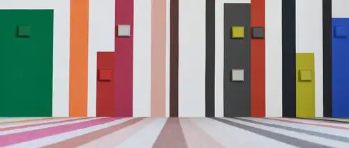
Coordinated with the wall colour: Coloured sockets and switches can be selected in the same colour family as the wall colour or set contrasting accents. A bold red light switch on a grey wall can be an exciting eye-catcher.
Matching floors: the floor as the basis of the room design
In addition to the walls, the floor also has a major effect on the atmosphere in the room. Whether parquet, laminate, carpet or tiles - the choice of floor covering should harmonise with the wall colour and the furniture.
Mineral colours: Natural and environmentally friendly
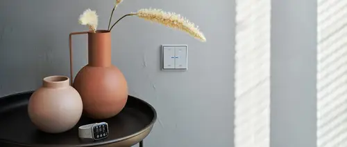
Mineral paints are an excellent choice for sustainable and healthy interior design. They consist of natural ingredients such as lime or silicate and are free from harmful chemicals. They are particularly suitable for allergy sufferers and people who favour environmentally friendly products.
- Advantages of mineral paints: They regulate room humidity, are mould-resistant and very breathable. They therefore contribute to a healthy indoor climate.
- Appearance: Mineral paints often have a matt, powdery appearance that makes the room look elegant and natural at the same time. They combine well with natural materials such as wood or stone.
Wall panelling: More than just colour
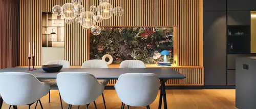
In addition to classic colour, wall coverings such as wallpaper or panels also offer a variety of options for designing the room.
Conclusion: the perfect combination of colours and materials
Colours have an immense effect on perception and well-being in interiors. When planning, builders should not only pay attention to the visual appearance, but also to the psychological effect of colours. Whether choosing a wall colour, painting tiles, colourful electrical installations or interior design - the right combination of colours can transform rooms and set individual accents. With the right tips and a little creativity, any home can be transformed into an oasis of well-being. A bold use of colour and a harmonious interplay of floors, walls and furnishings are the key to a harmonious and appealing living concept.