0
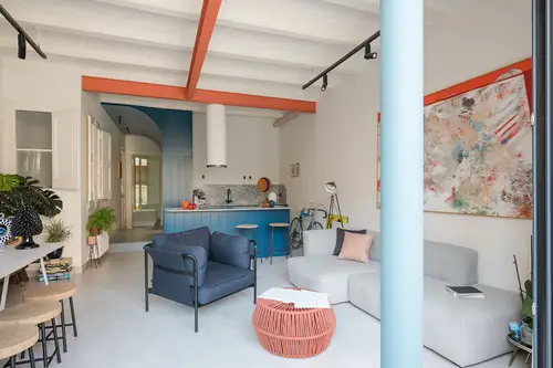
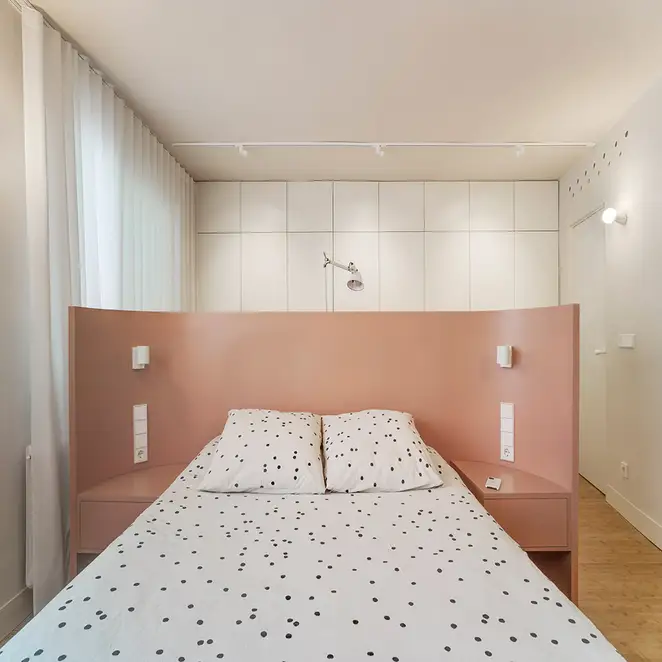
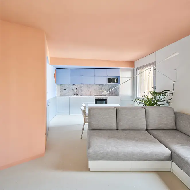
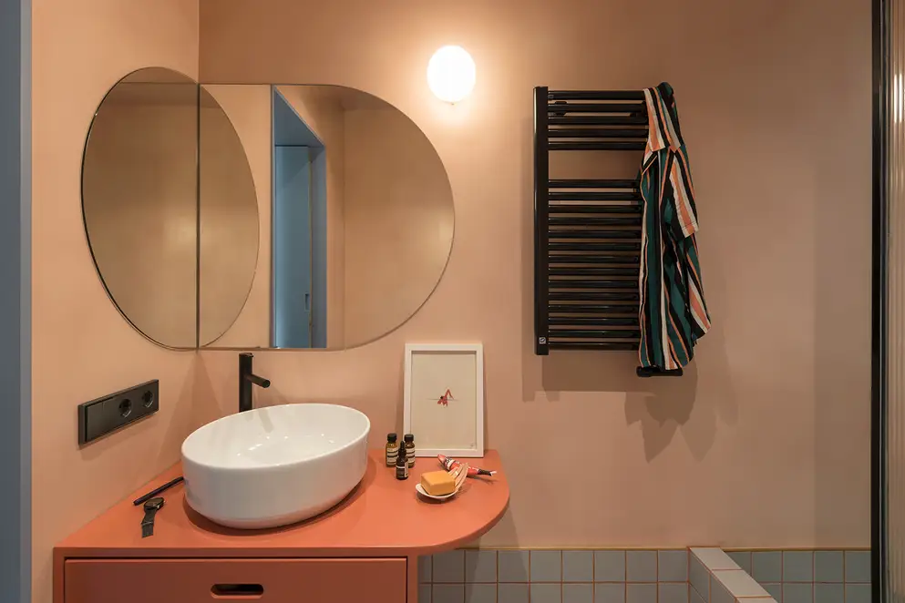
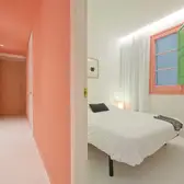
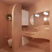
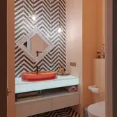
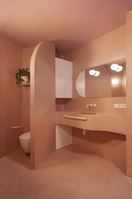
Tyche Apartment, Barcelona, Spain. Credits: Roberto Ruiz

7 Ways to Spice Up Interiors with Colours in 2024

“Colour in architecture – a means as powerful as the ground plan and section.” – Le Corbusier, Swiss-French architect. 

Colour has always played an important role in interior design, leaving its stamp on each era and attracting attention to what the next great thing will be. Recently, there has been a movement toward soft and warm colours, from the revitalization of pink in the Barbie movie last year to colours like Peach Fuzz and Apricot Crush being chosen as Colours of the Year for 2024. Peach, coral, salmon, and pastel pinks are just a few examples of colours that are both vibrant and soothing. 

 “[Colour] can say what words cannot”, says Laurie Pressman, Vice President of Pantone Color InstituteTM. The lean towards gentle and embracing colours could be an echo for the rigidity of spaces to be broken down and set the tone for those within to connect. Here are some exciting ways these colours can be incorporated to achieve different effects!

1. Colour Highlights

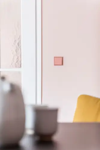
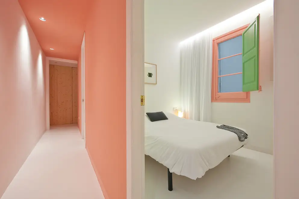
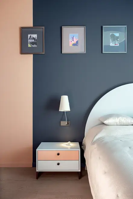
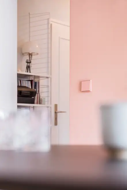
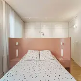
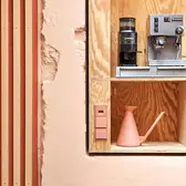
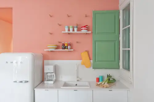
FONT 6 Apartment, Barcelona, Spain. Credits: Roberto Ruiz
The classic tried-and-true method to incorporate colours. Sparingly scattered, these pop of colours provide contrasts and add another dimension to an otherwise monotonous scheme. Accents in unexpected places can add a unique touch while also expressing creativity and making a statement.

2. Colour Blocks

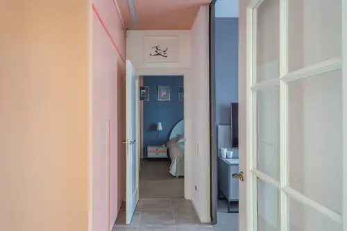
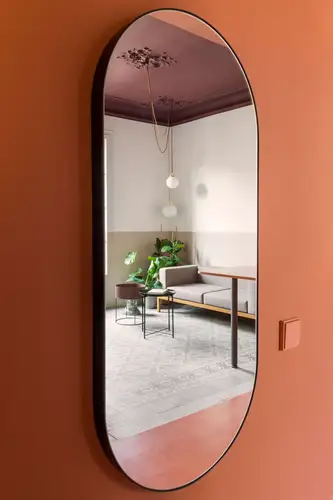
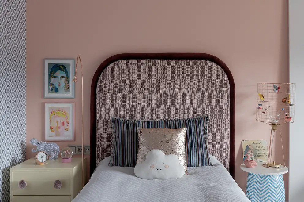
Kyiv Apartment, Ukraine. Credits: Ignatove Andril

Often attributed to Dutch painter Piet Mondrian as the origin for the concept of colour blocking, this approach to utilising large chunks of distinct colours and setting them beside each other as a contrast point has been a popular trend that will remain for the near future. Fun and exciting, especially when done with intentional asymmetry and irregularity, this approach characterises the space in a unique way.

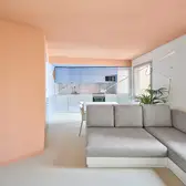
3. Colour Segmentation

Similar in style yet distinct in nature to colour blocking, colour segmentation is a purposeful use of colour to delineate spaces according to function. Behaving as invisible and permeable walls, it is an effective tool in visually separating different areas and giving the impression of an enlarged space as people traverse through the zones. Of course, all the while acting as a standout quality with vibrance and warmth.

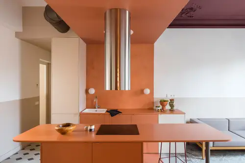
4. Monochromatic Schemes

While contrast often strikes as the go-to option when playing with colours, a monochromatic scheme is an understated approach to express creativity. By varying the saturation of hues for fixtures, different effects can be achieved. When paired with a lighter saturation backdrop, vivid tones can stand out as statement pieces. On the flipside, if it is intended to be an inconspicuous detail to highlight other fixtures, similar saturations can be chosen for a discreet look.

5. For a hearty and comforting atmosphere
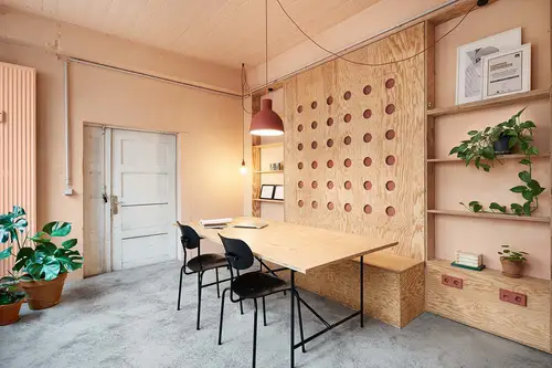
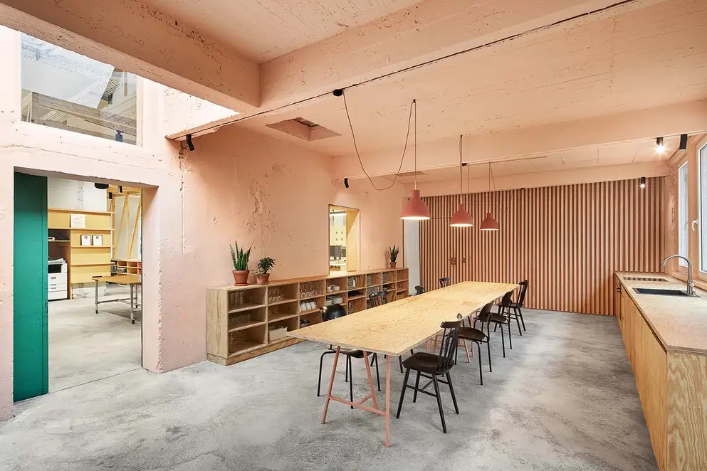
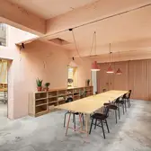
Office of andOFFICE in Stuttgart, Germany. Credits: Philip Kottlorz Fotografie
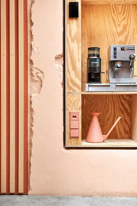
When it comes to creating a conducive environment for conversations, natural elements are a must. Appealing to our innate desire to connect, earthy elements like potted plants and wooden finishings ease the mind. Paired with the soft hues of pastel pink and salmon pink that are warm and nurturing, spaces can exude a soothing quality.

6. For a modern and practical aesthetic
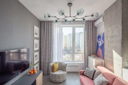
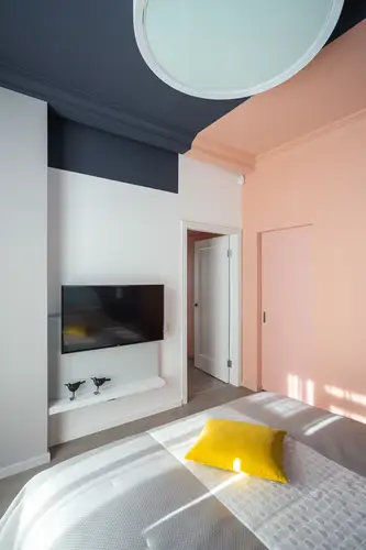
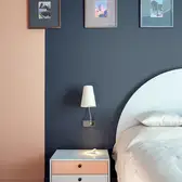
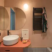
Kyiv Apartment, Ukraine. Credits: Ignatove Andril
For an alternate design style that prioritises sleekness and practicality, an unsuspecting yet fascinating partner for cherry blossom pink is the chic modern grunge look. Although seemingly belonging to different worlds, the array of greys found in modern grunge are brought to life with a vibrant splash of pink, guiding attention towards the centrepiece.

7. Colour: Beyond the Charm

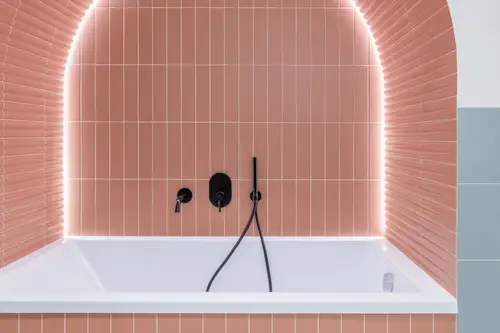
A Colourful Apartment in Vilnius, Lithuania. Credits: Studio Linkevičius
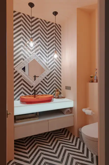
Apart from acting as a purely aesthetic element in interiors, colours can also be utilised as part of a functional element. As part of the requirements for a wet area, a shade of salmon pink was incorporated into the tiles that surrounds the bathtub and adjacent walls – a distinctive and playful take on the ordinary.
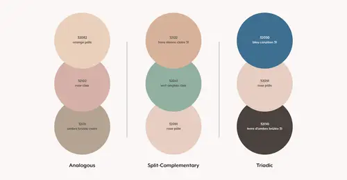
To match the soft and warm hues of orange and pink trending now, three colour palettes from Le Corbusier’s colour keyboards within the Architectural Polychromy have been identified, featuring three distinct colour theories: Analogous, Split-Complementary, and Triadic.
Credits: The colour keyboards of 1931, Le Corbusier
Well put by Le Corbusier, “Colour is an incredibly effective triggering tool. [It] is a factor of our existence.” What is exciting about colours is their immense potential to resonate with people's hearts, and its flexibility to become a form of expression that accurately reflects their unique character. The art form is constantly evolving with people creating new ideas for new purposes. As 2024 has only begun, there is much anticipation for the interior design landscape.

For more ideas and inspiration
Credits: David Frutos, Eugene Deshko, Henrik Schipper, Ignatov Andril, José Hevia, Philip Kottlorz Fotografie, Roberto Ruiz